

Designing great slides is an art-form. But those of us that are not artistically inclined, can still follow simple steps to come up with concise and slick looking presentations. The following tips are based on a few examples taken from our series of modules on Communication, Storytelling and Design.
You don’t need an art degree to create great slides.
All good powerpoint slides follow a basic blueprint that anyone can apply.
This is something I’ve picked up over the years of helping people tell large and complex stories. Starting as a communication officer, first in the climate science domain, and now in the consulting space, I’ve seen my fair share of decks, pitches and presentations. 🙂
Drawing from these experiences, I’ve complied 4 actionable tips that will help you improve your powerpoint slides.
1. Start on paper or excel
A trap I fell into in my early days, was to treat my slides as the place to ideate, sketch and finalize the end product. The problem with starting on a blank canvas is that the possibilities become endless. Which is exactly what we want to avoid.
What I find helpful is to start on paper or a word document. Here, I write the defining objectives of the slide: who is this for, what’s the story, and individual slide descriptions. I also add notes about the types of media or images I will need.
This process is even simpler on an Excel Sheet where you can make a simple table as shown:
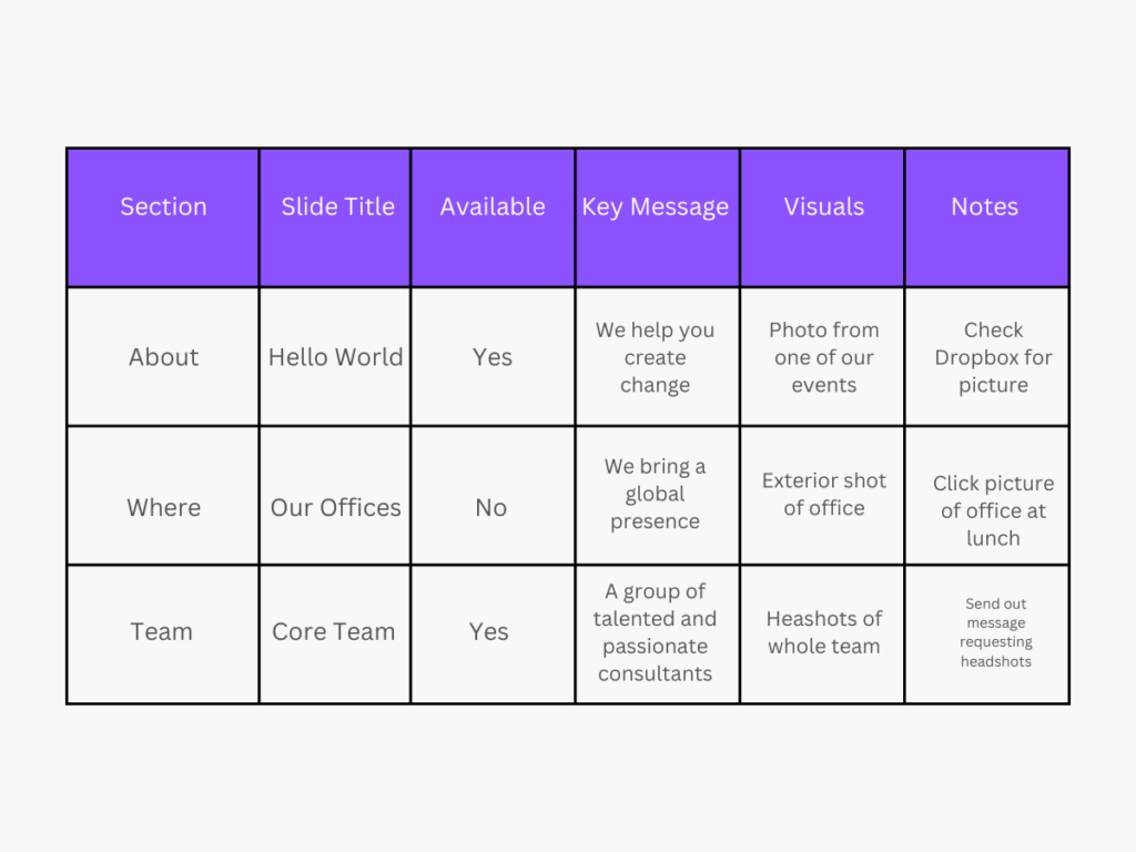
A few sections that can better help in planning out your powerpoint:
- Section: where you divide the deck into broad sections. This helps break-down your task into smaller units and makes the task of designing less daunting. It also helps you set the tone of your content and helps you plan its flow from one section to the next.
- Available: This indicates how many existing resources you have (slides, pictures) that you can reuse in this version. It also gives you better understanding of how much time you would need in designing new elements.
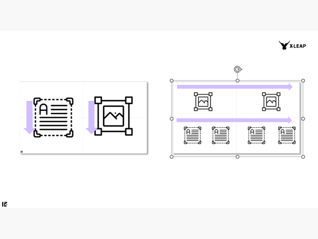
2. Use quadrants for better composition
Your real estate – or the blank slide – in recent Powerpoint versions is in a widescreen format.
Presented in a 16:9 ratio, this means that you have more horizontal space to creatively arrange your elements.
To better do this, it’s always helpful to divide your slide into four quadrants. These quadrants will act as guides in planning out your visual and text elements more efficiently.
And although the permutations and combinations with which you can do with this are endless, here’s a few examples that can help you get started. The end result is better composition.
3. Pay attention to hierarchy
A well-designed slide also has a well-designed hierarchy.
By looking at a slide that follows the rules of hierarchy, you’re immediately able to tell what the slide is about (the heading), and what its key points are (body of text). It also is able to balance imagery with text on the slide.
Here, your decision to use quadrants and decide information flow can come in handy. In fact, hierarchy and composition are inter-connected in the way that one influences the other. Both help you in deciding how much information to include in a slide and how best to balance it with other elements like data.
Hierarchy is crucial in helping your readers quickly understand information while holding the narrative flow in their head when moving from one slide to the next.
4. Create a (relevant) photo bank
This tip saves a lot of time especially when you’re working against a deadline.
At the ideation stage (Step 1), you should ideally be able to map the audience that will be viewing this presentation. This will also help you decide the images that are likely to suit them best.
It’s easy to rely on stock photography to beautify your slides.
But the downside of this is that your company’s brand identity gets lost.
One way to build a relevant photo bank is to associate words that are linked to your brand color. If you don’t have a brand color, then think about the impact that you brand wants to achieve.
Then make a list of keywords that you can associate with this impact and search online for relevant pictures that tie-in with these words. Unsplash is a great place to start, and here you will find photos that can be used for commercial and non-commercial use.
x-x-x
Given the ease of each step, you can immediately start on the four points above before you get down to designing that wonderful deck that’s due for your client. Remember that there are plenty of online resources like Behance and Dribble, that can also give you further inspiration with designing great looking slides.
You can download a preview of the training module used to teach about Powerpoint design, below: